|
Something a little new, I thought I would review museums as seen in movies, just for a bit of fun.
Being the lover of action films, I’m not sure how I ever missed Demolition Man. However, watching the movie set up some particular narratives, that I’m definitely not on board with, I’m not devastated by this hole in my pop culture knowledge. There is a museum scene in the film, which I found pretty amusing.
0 Comments
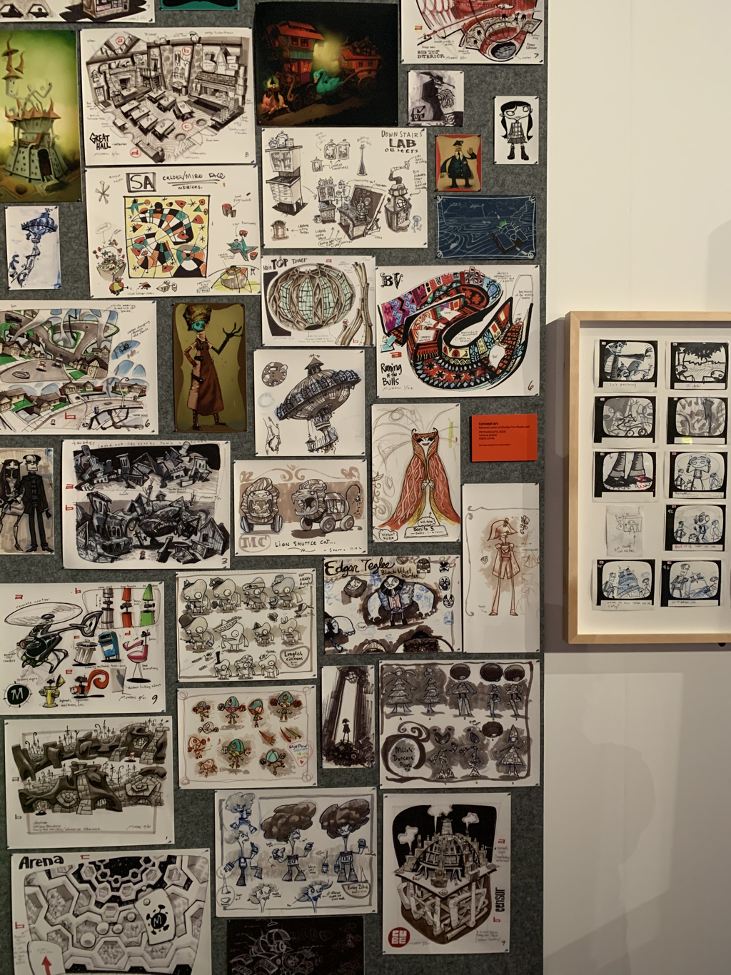
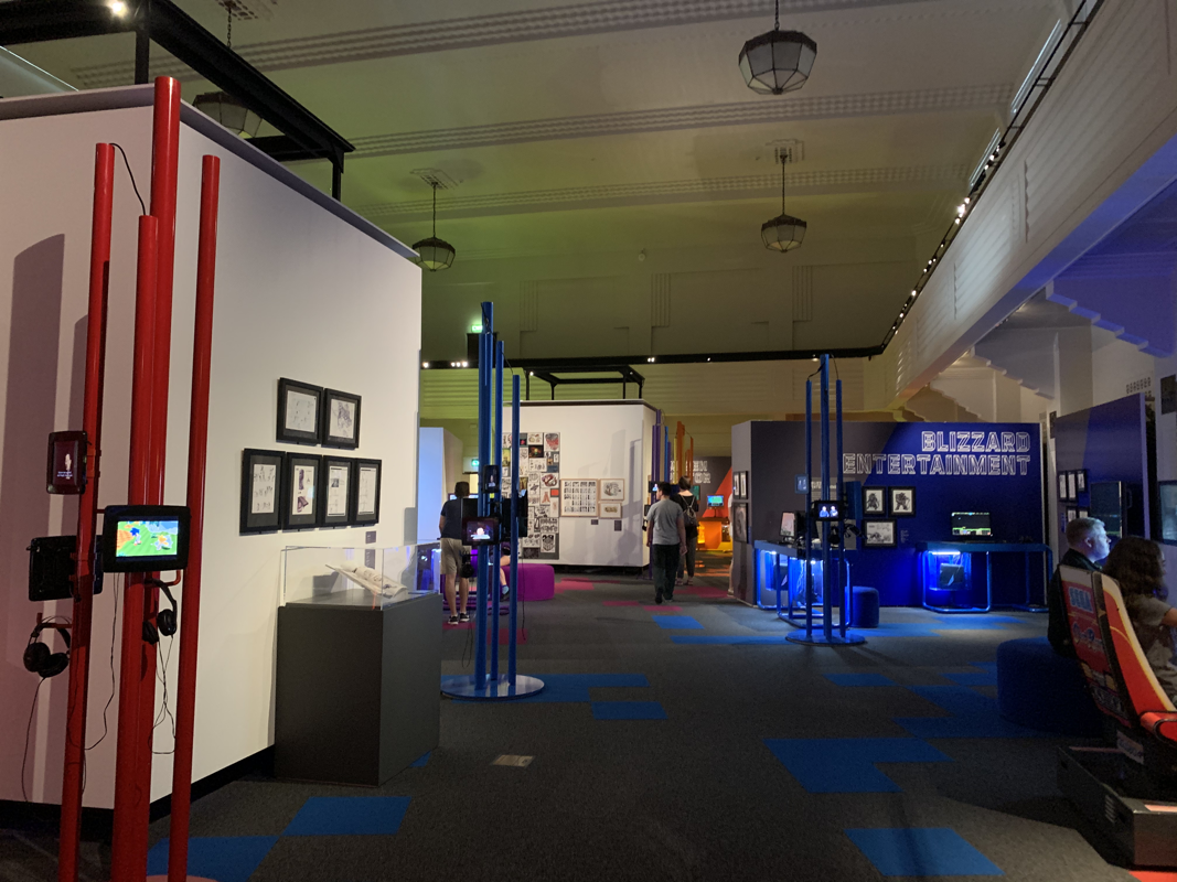
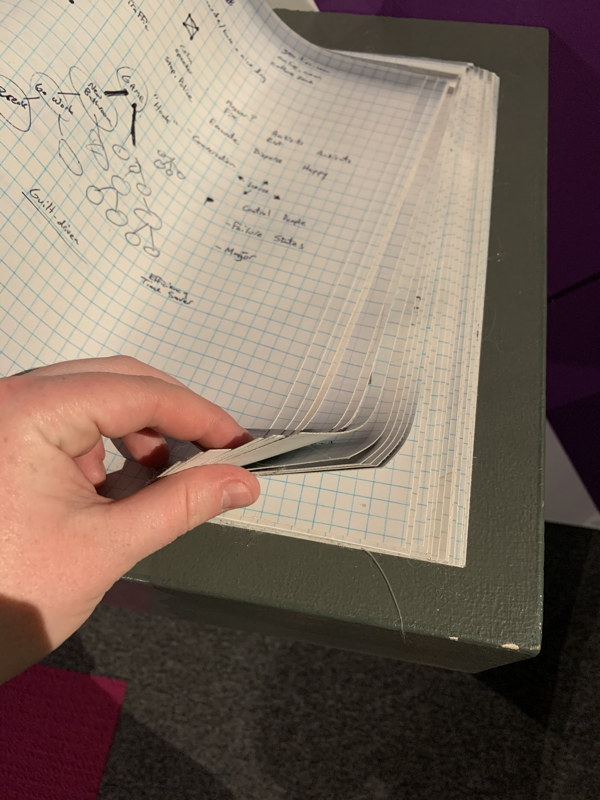
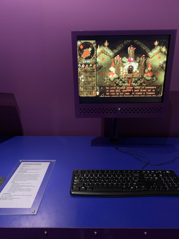
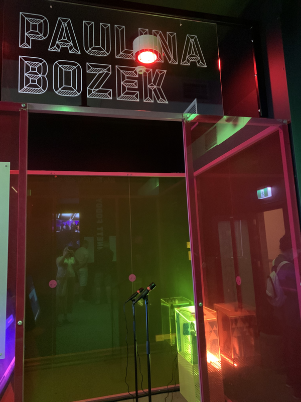
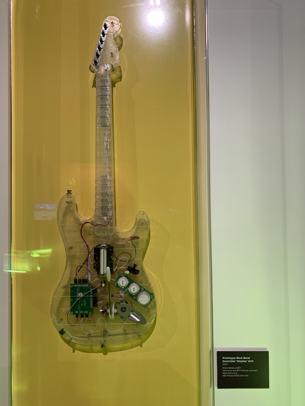
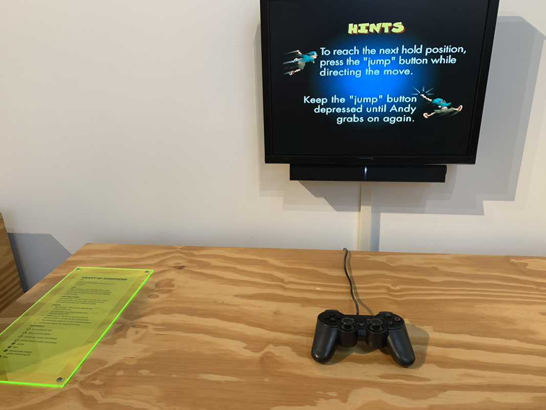
There is nothing quite as satisfying than having a moment where a number of your passions come into alignment at the same time. Last weekend I had the joy of visiting the National Sound and Film Archive to explore the new exhibition ‘Game Masters’. My museum life was hanging out with my gaming life, and I don’t think I could have been more satisfied. The world of gaming is going through an incredible time at the moment. Back when I was a wee girl in the 1980’s popular opinion made video games the realm of the young and those who had nothing better to do. They were something to scoff at, an illegitimate form of entertainment and the domain of the basement-dwelling white pasty male. Honestly, I felt like a bit of a rebel against society. A girl who was playing games and thumbing my nose at those who thought my past times were a sign of immaturity. For me, and many of my friends, they were a style of storytelling that I connected to. The games that really stick out in my mind are Zelda, Final Fantasy and the Dungeons and Dragons PC games. I migrated from console and PC gaming, and made my way into tabletop games, designing stories and worlds that would explore the narratives that I connected to. I think it moulded me into team player, a deep thinker and a problem solver. I’m extremely impressed to see that the National Film and Sound Archive are accepting their first games into the collection. It’s only right that collections start to reflect this medium more fully, not just an art form, but as something that has (and will) influence society. It will be interesting to see how they go about this process with some game consoles beginning to get to the end of their spare-parts life. It sounds like a great adventure in future planning! The Game Masters Exhibition is fabulous. The exhibition was initially debuted in its home, the Australian Centre for the Moving Image. It’s travelled extensively overseas, and this is its first visit to Australia. The exhibition stretches over three spaces all of which include a startling number of games that you can play. This is a hands-on exhibition, with staff on hand to explain ideas and gameplay to visitors. I loved the theming of the spaces, and the text panels were spot on. It’s rare to see so much information readily available about the game designers and how a game comes together. The games were all working, almost a miracle considering the breakdown rate of touch screens and TVs in exhibitions. The games and designer choices are really thoughtful, pulling out trailblazers that started genres (like Wil Wright, Peter Moyneux) and new Indie designed creating amazing concepts (like thegamecompany and Ken Wong). There were many moments were Mr Geek, and I made squeaky excited noises where we found a game that we loved and felt connected to. We tried a few new things. I oooh-ed and aaaah-ed at drawings and handwritten notes and company structures and models. It was just fabulous fun with ways of engaging people who may have no interest in the genres at all. There are a good number of photos below with notes. I wish there were a merchandise shop for this one because I would have loved to go home with some swag. I like that the exhibition wasn’t buying into the stereotypical mouth-breathing basement-dwelling nerd. I felt very welcome and among a wide variety of people from the community. I was not the only woman playing enthusiastically on the consoles, which was fabulous to see. There were youngesters, all the way through to people who may have started gaming significantly before I was born. Whether you love games, feel confused by them, or just want to understand what the gaming community finds in them; this is an excellent opportunity to learn about why they matter and who some of the movers and shakers have been. PS: A shout out to my Dad who had Captain Comic installed on our very first computer. A shout out to my hubby for introducing me to Dungeons and Dragons, and to Mike for letting me play on their Nintendo 64. A big shout out to my weekly gaming group who I design with, solve problems with and imagine better worlds with.
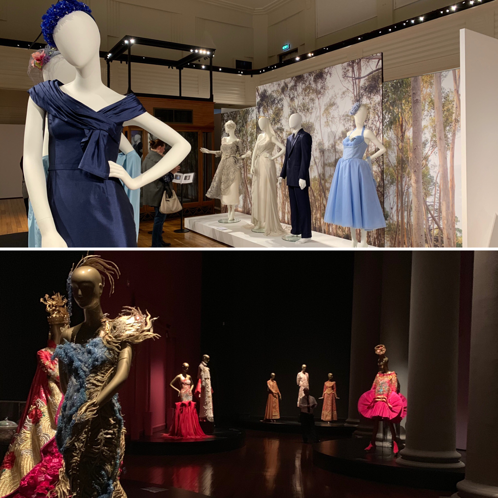
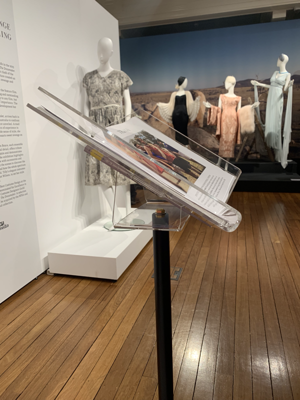
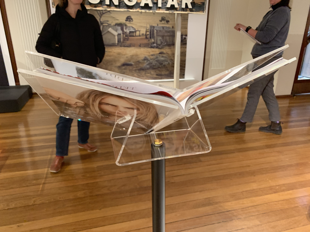
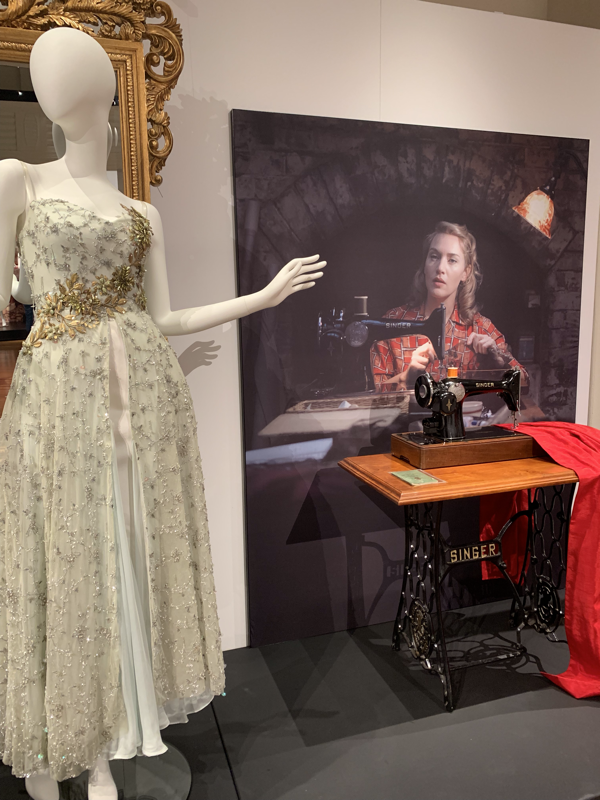
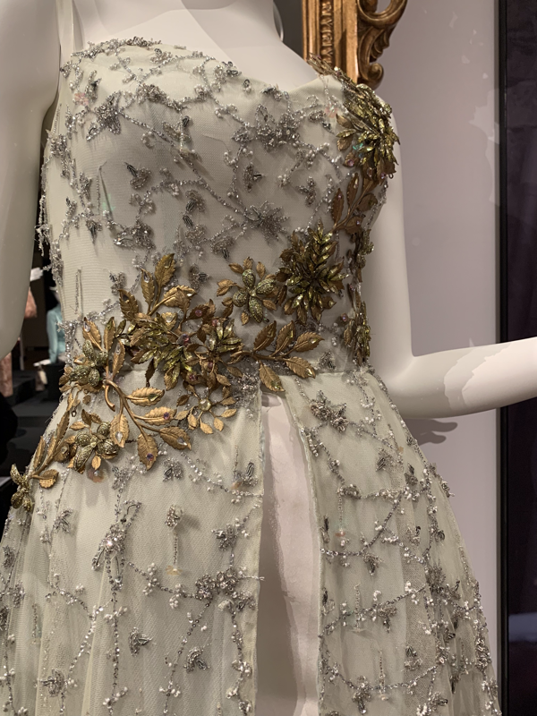
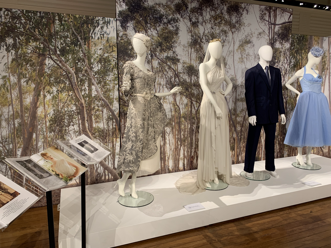
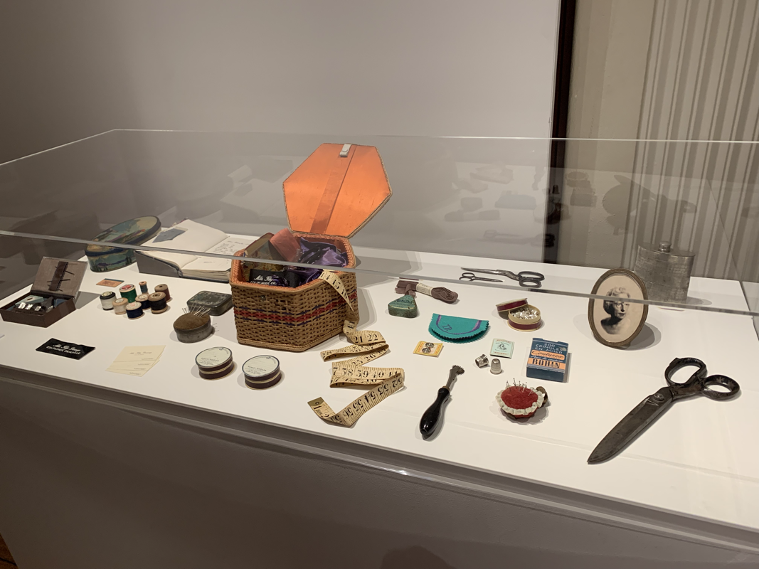
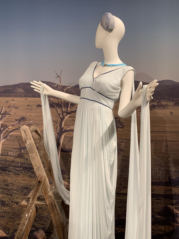
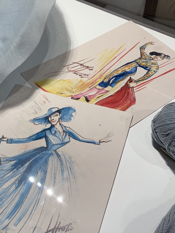
I popped into the Dressmaker Exhibition, at the National Sound and Film Archive, and was thoroughly impressed. 8 years living in the ACT and I am kicking myself for not checking out the dozens of previously advertised NFSA exhibition. This exhibition closes on the 18th of August, so if you haven’t seen it, I would suggest going sooner rather than later. The Dressmaker (the film), is an Australian classic. Having been convinced to watch it by my lovely Aunty, I will admit that it wasn’t specifically my cup of tea. The filmography and costuming were amazing, the story building is fantastic, but it was thoroughly lacking in superheroes and fast cars. Incredible film though, just not my taste. The film is probably best described as a revenge/comedy/drama set in outback Australia and explores the mysterious past of the female lead character Myrtle Dunnage. Myrtle is a fabulous dressmaker, which means that the costuming has a strong place within the film. Although I enjoy costuming and anything textile, the Dressmaker Exhibition had been in my peripheral view, and it took a lovely friend arriving in town with a love for dressmaking to decide the matter. I loved the costumes on display. They were amazing. Lovely textiles, great embroidery, beautiful dress shapes. Beyond the costumes, I loved the exhibition itself! It was interesting comparing the atmosphere between this exhibition, and my recent exploration of the Guo Pei exhibition. The Geo Pei exhibition was glamorous and it felt like you could be looking through a veil while standing on the runway or in the dressing room with the mannequins. It creates a dreamy feel to the whole exhibition. The Dressmaker Exhibition was the complete opposite. The dresses (and suits) stand with the set photography behind them in lovely bright lights. The display cases provide further insights with additional props or equipment, deepening the narrative behind the scenes that called for each piece. For many parts, it was easy to feel as connected to the dress as it was to the atmosphere and narrative of the movie. Remote Australian, with this injected glamour, and a whole bunch of f**k this. It felt punchy, not dreamy. It’s probably a ridiculous thing to focus on, but I also loved the magazine stands. Yep... magazine stands. It’s for two major reasons. Firstly, the magazines that were on display described the costumes as if they were haute couture. It felt like it was something the character, Myrtle, should have. It felt like the pieces were being elevated to the runway in Paris she belonged, and that it was throwing shade on the denizens of the horrible little town. Secondly, the magazine stands were just really nicely constructed and low impact on the exhibition itself. I took a surprising number of photos that I think may have confused the poor museum staff member who was looking after the floor that day (thanks for your patience!). Marion Boyce plays a dual part in this fantastic exhibition: She is the designer/curator of the exhibition but was also the film costumer designer for The Dressmaker. I’ve noticed several future exhibitions that are tied to her, which I will certainly be making a point to visit. I felt like this was a worthwhile exhibition to see, if you would like to snap up a ticket you can either buy them at the counter or pop onto the NSFA website: https://www.nfsa.gov.au/events/dressmaker-costume-exhibition
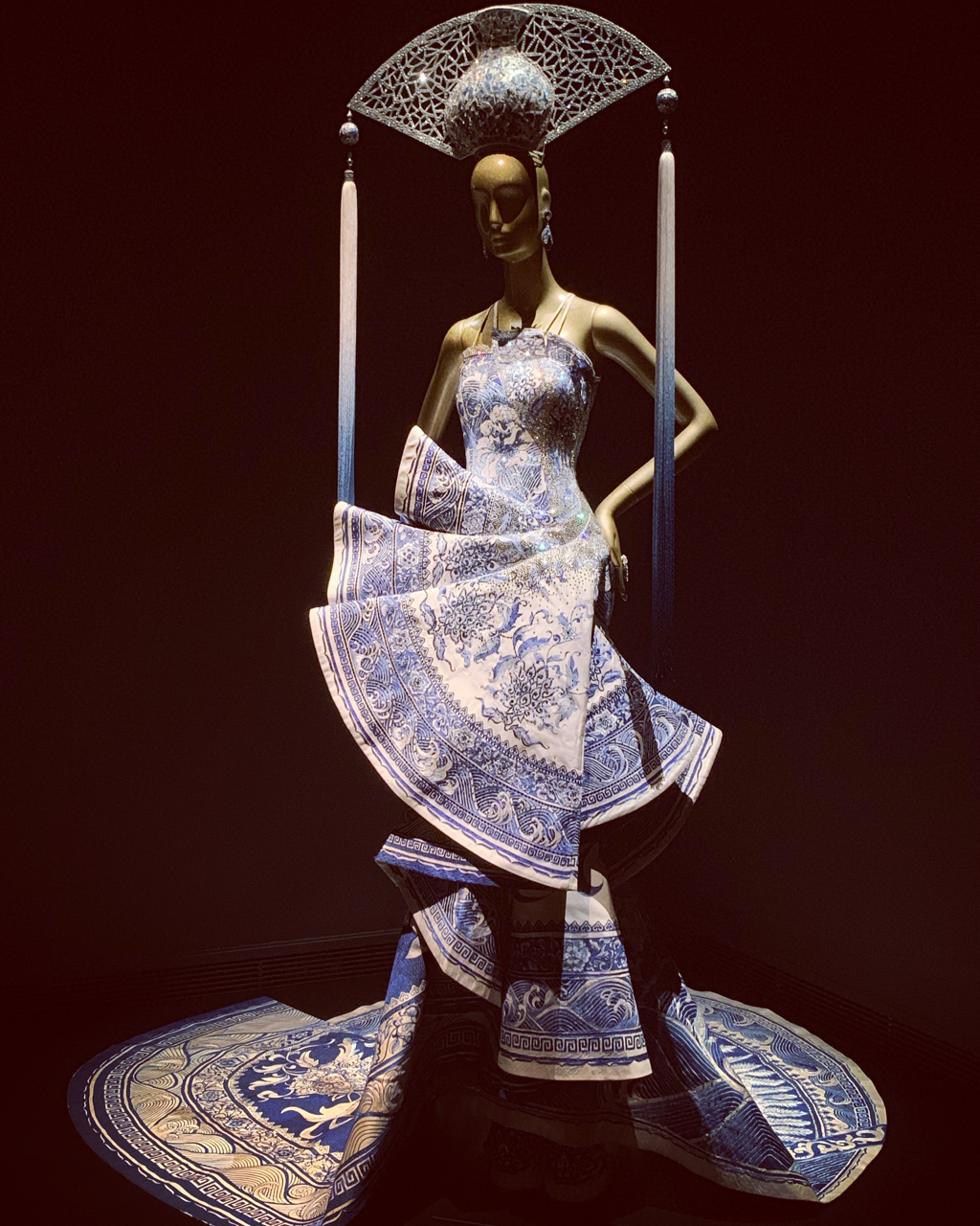
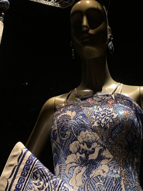
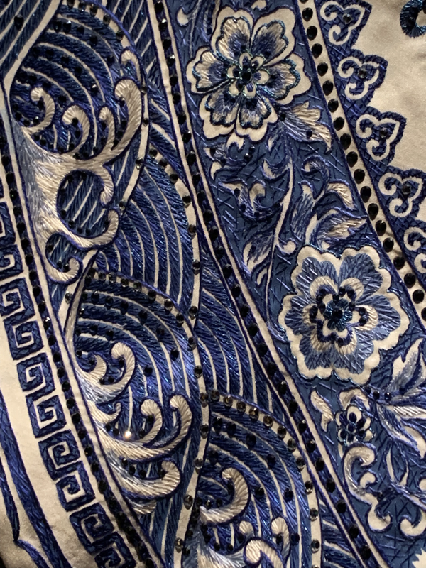
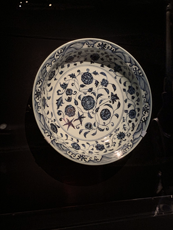
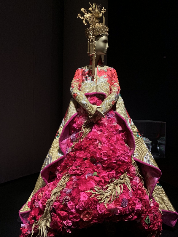
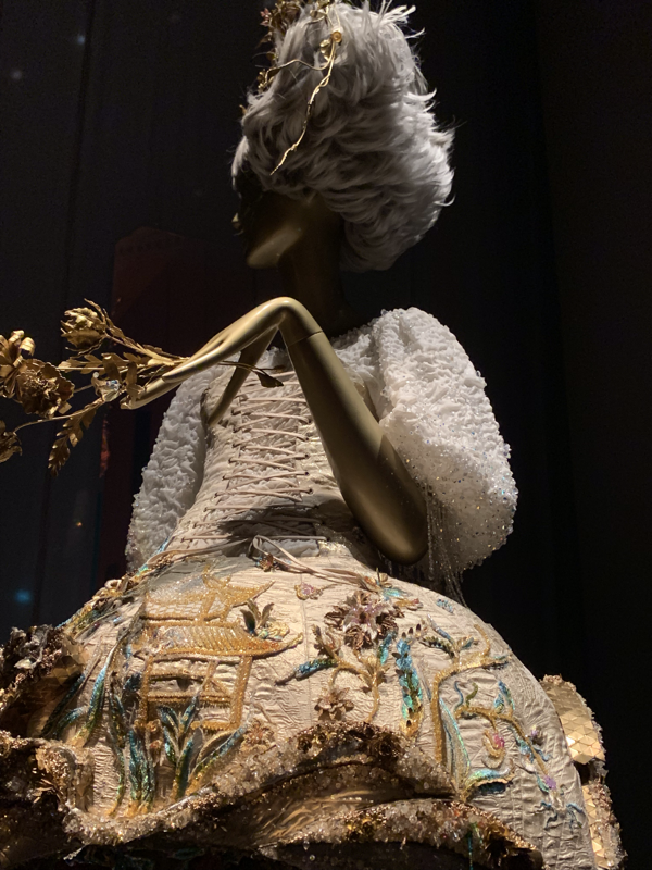
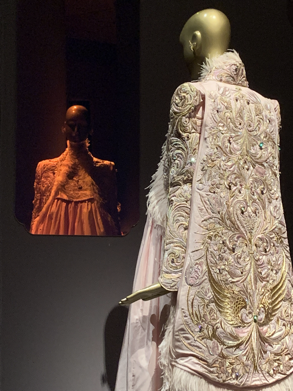
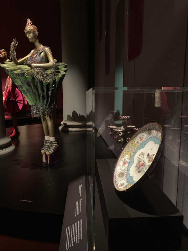
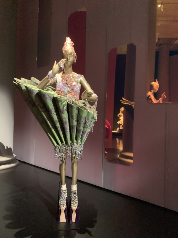
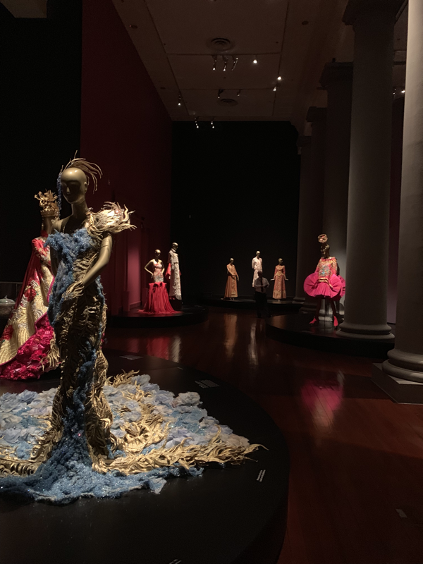
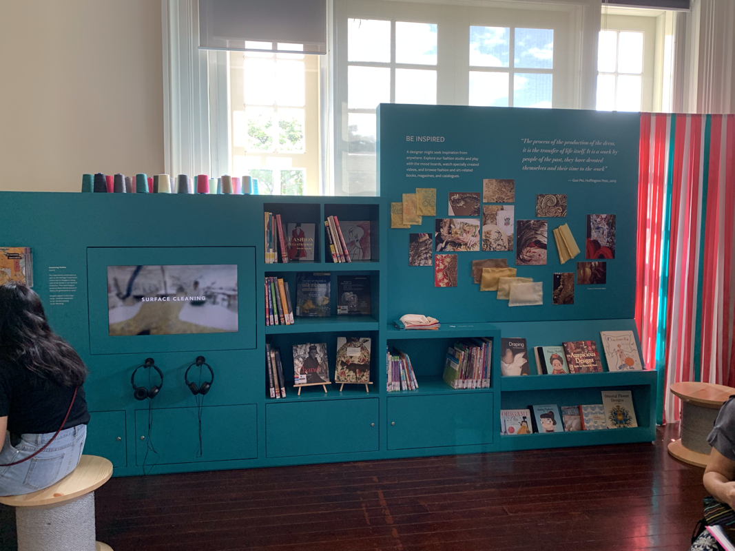
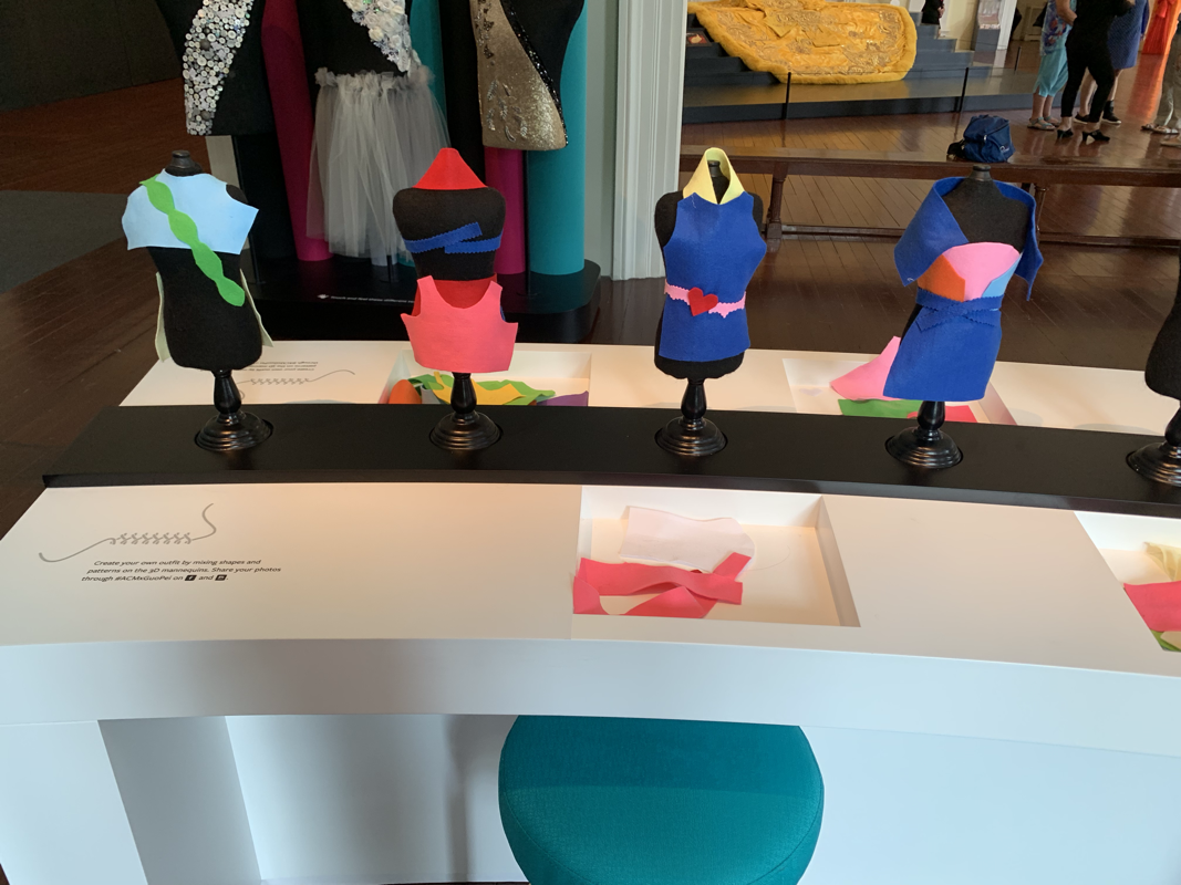
Friends, I love embroidery. I’m sure you have already picked that up. Yesterday, I went to an exhibition at the Asian Civilisation Exhibition on the work by Guo Pei that just sunk into my soul. That moment, where people talk about being emotionally moved by a piece of art, or music? That was me, in awe. The embroidery and beading work is beyond anything I have ever seen in person before. Beyond literally getting lost in the design of the works, the exhibition design is divine. And it has a fabulous education section. I was in heaven. Guo Pei is China’s leading couturiere, creating not only incredible clothing for famous people, but also artistic pieces that are mind blowing. Having started sewing at the age of 2 (!), her career started in Tianma and then moved on to create Rose Studio in 1997. Gus’s dresses are designed to tell a story, through the medium of fabric and textiles. The entire outfit stitches together to tell a narrative. Her most famous work is most likely what the media started calling the ‘Omelette Dress’ (I believe it’s actual name is the Empress Dress), which was worn by Rihanna during the Met Gala in 2015. The exhibition is beautifully designed, with lighting that highlights the dresses perfectly. The first section, has a minimalistic wardrobe feeling to it. The dresses are displayed next to either clothing or items from collections that form part of the inspiration behind the design. In the second section along, the dress on the mannequins have well placed mirrors around them, giving the impression that the wearable items are being admired by the wearer. When you move into the last section, which are highly sculptural artistic designs (only really worn for the runway) the mirrors disappear for the dresses to stand by themselves in the space. The interpretation is spot on. Short and easy to read panels, and the exhibition guide (in multiple languages) doesn’t just repeat exactly what is on the walls. There is soft music to set the feeling of the space, and benches to gaze upon the works. I loved the education section of the exhibition as well, which is designed for both children and adults. The learning space is located well and truly on the other side of the exhibition, where the prized Empress Dress commands the space. There are a couple of really great reasons for the location: the noise of creating and having fun doesn’t leak into the other galleries, it’s outside of the paid section so it can tempt people in, and it a lovely well lit area. There is a reading area with books about art and design in fashion, a creation space for making clothes on mannequins and a great embroidery area that doesn’t include the risk of visitors stabbing themselves with sharp needles. It’s really just fabulous and inviting for anyone to touch, play and learn. Go see this exhibition, it you can. It’s wonderful and inspiring, both as an embroidery geek and as a museum design/interpretation enthusiast. I am so glad I had the chance to see this. I left with a much great appreciation of Chinese art and fashion.
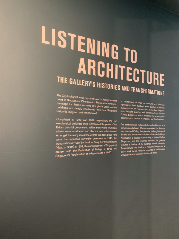
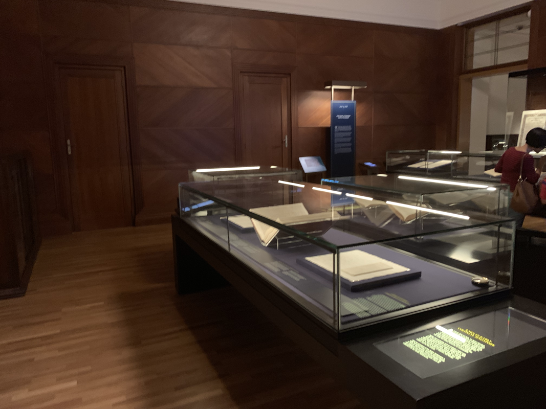
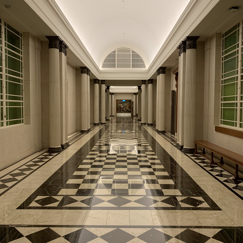
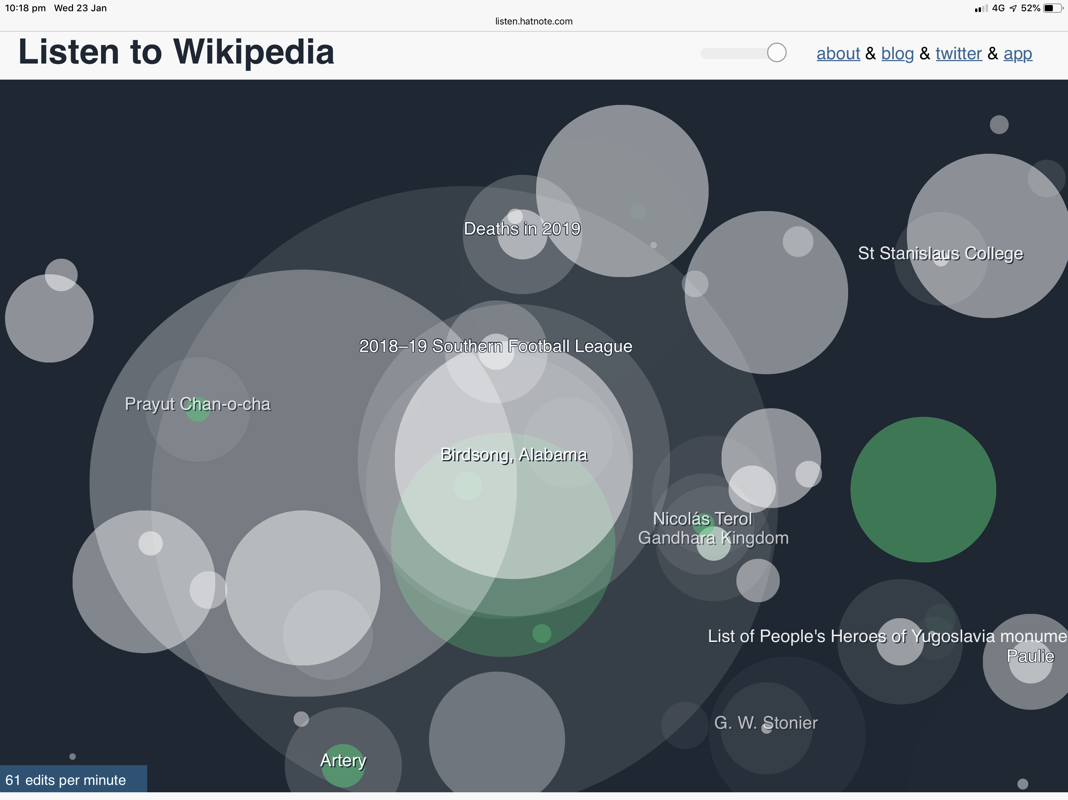
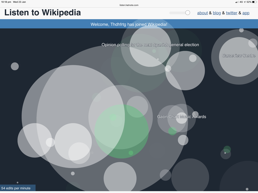
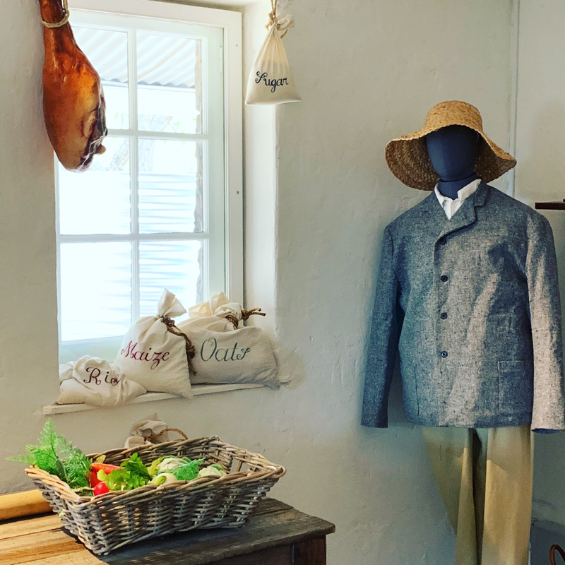
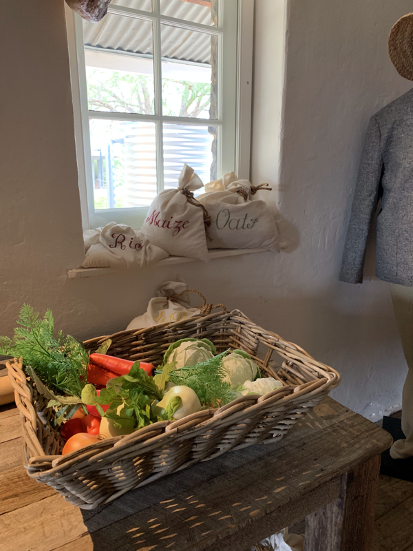
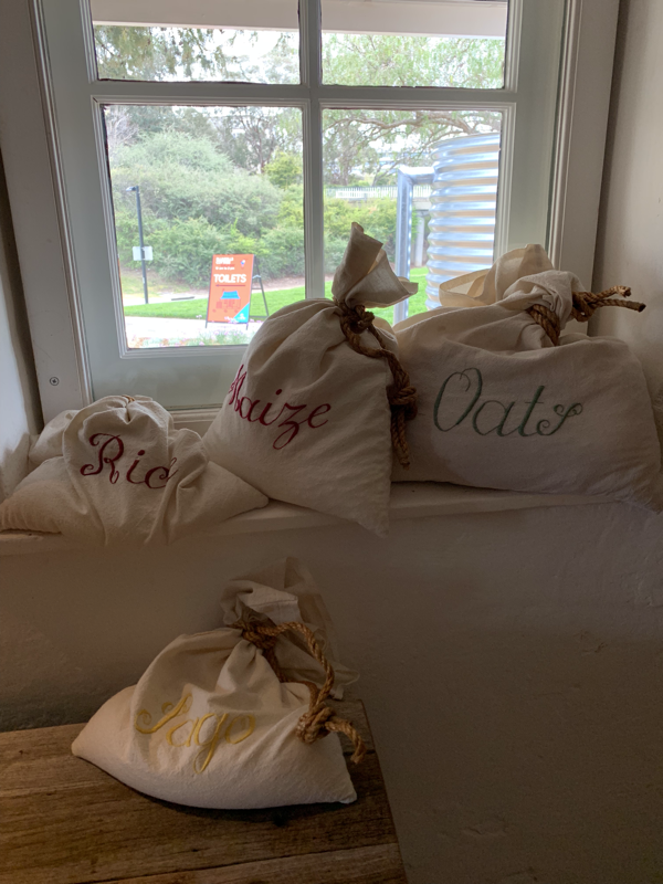
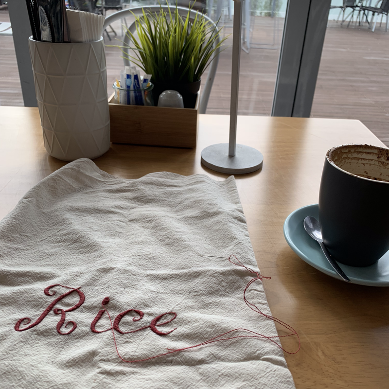
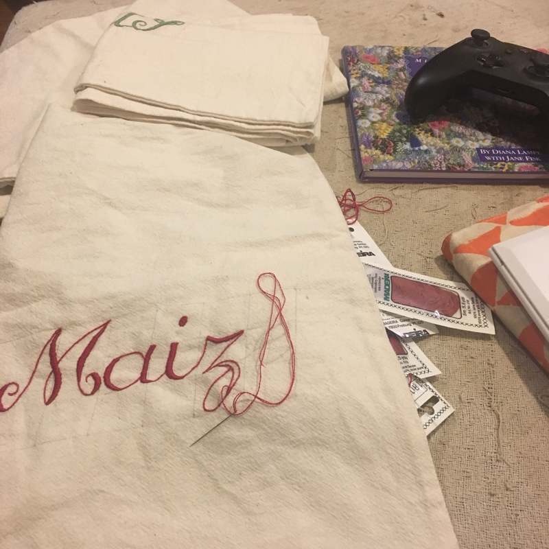
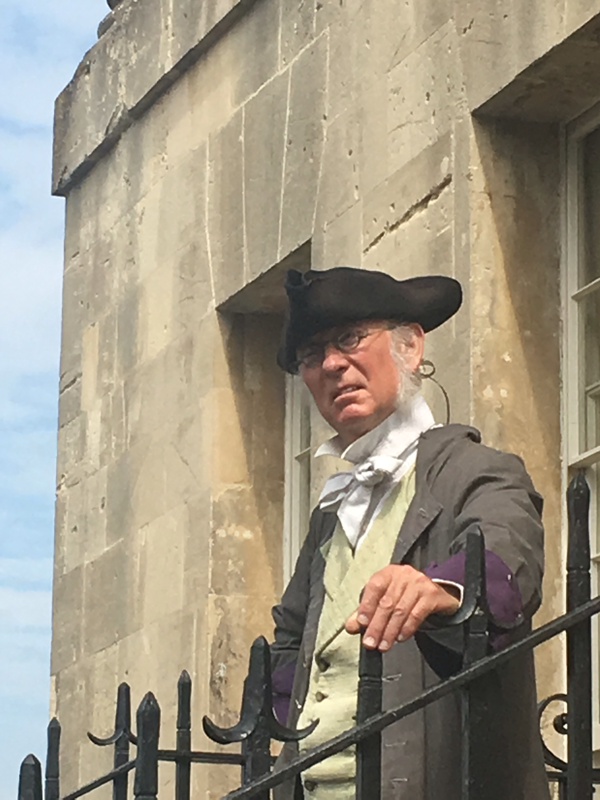
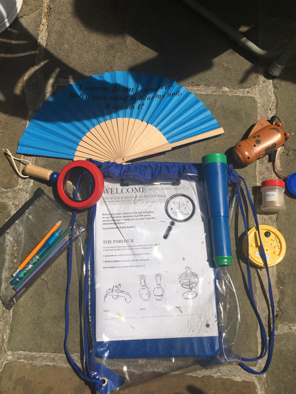
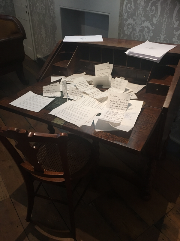
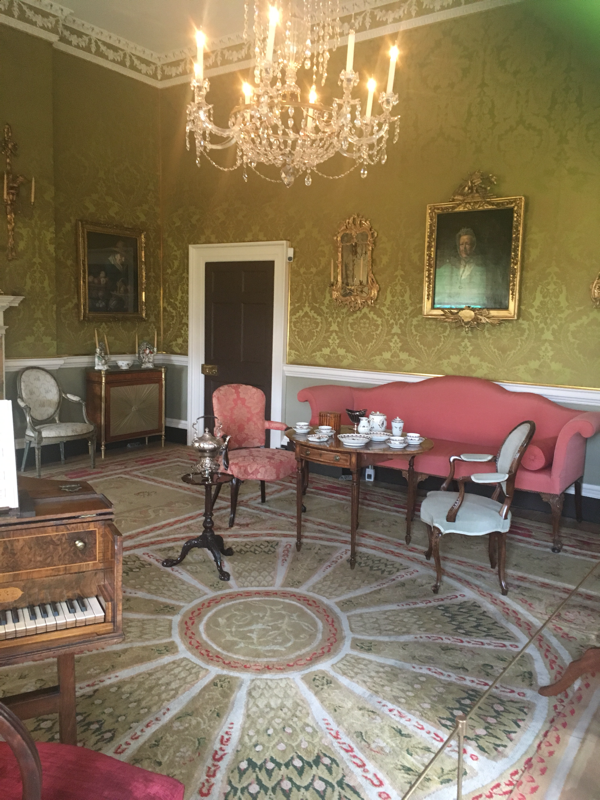
There have been very few buildings I’ve visited in Singapore so far that are still being used for their original purpose. Singapore is both old and new, with buildings being repurposed to fit into current requirements. I feel that this is probably better then knocking down lovely heritage buildings, but in the case of places like Haji Lane can be jarring or cause cultural clashes. Today we went to see the National Gallery, and I was pretty blown away by the changes to the two heritage buildings. The National Gallery Singapore opened in 2015, which makes it a surprisingly young institution. It’s focus is on Singaporean art and culture, and works that explore Singapores global connections. The Gallery consists of two main buildings, which are connected via a glass atrium (which reminded me of other museums such as the British Museum and the National Museum of Singapore). The two main buildings are the original City Hall and Supreme Court. The two buildings are connected via the covered atrium and two link bridges at different levels. I thought that the way the two buildings were treated was quite interesting. The City Hall side felt like a brand new building. Without having been told that it was a converted office area, I would not have guessed it’s origin at all. The area has been made into large long galleries, with an open air space plunging down the middle. At the lower level, there is a completely kick arse children's area, which I will hopefully get a chance to rave about a little later. It has a level of gallery noise, which is to be expected in a busy space. The art works within this space were in capsules, and cut off from a narrative linking them to each other. The Supreme Court side is quite different, as there is an attempt to preserve some of the nature of the original building. The first thing that struck me, as I walked through the heavy doors, was the complete quiet of the space. The building had been designed to suppress noise inside, which when cut off from the noisy galleries, gave the space a somber quality. The galleries include hints of it’s previous life: a pulpit still in place, viewing areas in dark wood, spaces where judges would have sat. The art in the Supreme Court side had a very specific nation building narrative, with rooms leafing logically to each other. Significantly, the Chief Justices office is filled with nation effecting documents on display, such as the divorce papers from Malaysia. I wondered why these two buildings felt so different. I wonder whether it is because the role of the Supreme Court is more relatable to visitors - what happened here? Law stuff happened here. It was probably important. Where as the city hall section is filled with the faceless people that help to make a government and country to run. Government workers rarely get wigs or robes to work in. I felt like I had a clearer connection to the heritage in the Supreme Court, where as City Hall honestly felt a little hidden. Or it could just be that too much of the City Hall section was closed, awaiting the new exhibition that is opening on Saturday and taking up a substantial amount of the City Hall space. I do really love that they have two (and a bit) exhibition spaces open that describe the history and transition of the buildings. Large panels describe the original purpose and designs, the archeology of what had been found on the site during digs and explanations on why choices had been made. Many of the panels included a small pin mark that explained where you could find the feature that was being discussed. I have seen a growing tend in embracing displaying works done within museums, and I think it is really fabulous. I really liked what they have done to the space - it’s felt connected while still feeling modern and a bit slick. I don’t think that the heritage of the building it specifically lost, but it is more muted. It was a thoroughly enjoyable gallery to visit. Some articles that I read while writing this blog post: The Architecture of National Gallery Singapore http://www.designandarchitecture.com/article/the-architecture-of-national-gallery-singapore.html Design of the Year 2015 https://www.designsingapore.org/pda/award-recipients/2015/national-gallery-singapore National Gallery Singapore http://www.urbanarchnow.com/2015/11/national-gallery.html Today, I have had my mind mind officially blown away by the coolest piece of data visualisation! I know, I’m probably slow to the scene, but you should immediately go and check out: http://listen.hatnote.com No seriously. Right now... Okay, maybe after I have finished raving. The website is Listen to Wikipedia, and it’s purpose is to create audio that represents the creation and removal of data on Wikipedia. The sound and strength of the notes depends on the size of the edit and who made it. The sound is absolutely lovely, and somewhat meditative. While the music plays, the titles of the pages being edit pop up on the screen like soft bubbles. What an engaging and lovely way to display this data! I can’t help but wonder what this would sound like connected to Trove. Or if it could be the sound in an entrance to a museum, being triggered off by people using the website or the data. This style of visualisation could provide a beauty that connects people to the importance of research and information creation. A bit of research tells me that this isn’t the first amazing visualisation project that has been created the designer Mahmoud Hashemi. Working with Hatnote and Wikipedia, the designer has been a part of a number of heritage based visualisation projects, that are just very cool. I hope this brings a little joy into your life this week. http://sedimental.org/hatnote_projects.html It’s interesting just how much angst I have felt about writing this blog, and amusingly this morning I found that the draft I had been working on had disappeared. Which means I have had even more time to dwell on the embroidered food bags that I have recently completed for a heritage home display. The food bags were decided on to fill an interpretation hole in the space. The space is not able to have any panels or electronic means for interpretation, but there is an enthusiastic volunteer and staff team. The embroidered food bags were to be added into the living area of the 1860s zone, along with a number of other display food items. A common way of storing dry staple foods during this time period were cotton bags, but having bags without interpretation seemed lacking in depth. We were also a little concerned about people trying to open them and spilling the stuffing out in an attempt to work out what was in them (curiosity being the chief mother of invention and also mess). I am an embroider, and love spending time on researching historic embroidery pieces. I sadly have been unable to find any indication of embroidered food bags. However, I can prove that women on their way to Australia on the boats did spend time embroidering and sewing small pieces. I can say that Mary Ginn, the first female occupant of the cottage was educated and likely had been taught embroidery as part of her education. We know that she could read and write. The font used for the bags is from a period embroidery book, which was fairly readily available. I do know that the fabric is on par with what should be expected, the threads are right and the stitching style is popular during that period. Can I prove that there were absolutely embroidered food bags in the 1860s? No. And it drives me crazy. So why am I admitting to this? During the Open Palaces Programme, I was struck by a talk that was given at the Tower of London. The Yeoman Warder who took us around during our tour was incredibly open about what had been tried and succeeded. Beyond that, he told us what hadn’t worked. Why it hadn’t worked. The processes that led to both success and failure and how they measured those attempts. And it inspired me, because in failure there is a great amount of strength. Knowing what has and hasn’t worked helps us to grow. So, have I failed with these baggies? I don’t know. On one hand, the interpretation works perfectly. Visitors react to them really well and ask why the food is in bags. It sets up an indication of what hand writing could kind of look like. So there is some great things happening. However, I feel like it’s not quite right, so I will keep looking for evidence (whether for or against). I think the chief thing I could have done is finish them a hell of a lot faster. Part way through the process, I froze up with anxiety over whether they were right and how they would reflect on my (and the heritage home) if they were wrong. That was a good learning experience, in that sometimes you need to go forwards to give yourself time to think in the future. I can also say that the embroidery was travelling at about 1 letter per two hours, on average, so they took a really long time to complete. There are dozens of little things that my perfectionist brain hates as well, but they are far less useful to dwell on. I don’t know if I will call this any type of serious failure. I will call this a learning experience that I can develop from. I will also be open and transparent, because failure is healthy. It’s good to fall over and make mistakes and doubt ourselves. And if we share these stories and these thoughts openly, then it helps others to make informed choices in the future. It also just makes us feel less alone. Firstly, I think I should acknowledge my own naivety before going over the England for the first time. There were many things that I had made assumptions on, or simply underestimated in large ways. No 1 Royal Crescent, visited for a workshop conducted with the Open Palaces Programme, was one of those underestimated locations. I have been to many heritage houses in Australia, and so I was mildly interested but not overly enthusiastic. By the time I had completed my first two sessions with the Bath Preservation Trust (Beckford’s Tower and Museum of Bath Architecture), I could not wait to listen and learn from Dr Amy Frost again. Honestly, I would have happily listened to her in any location, No 1 was just a receptacle for another workshop and I was okay with that. No 1 Royal Crescent is not simply a heritage house. It is part of a series of 30 houses, joined together like modern townhouses, forming a concave crescent. Built between 1767 and 1774 by John Wood the Younger, it is a stunning piece of Palladian design. The Georgian architecture is stunning, and standing on the parkland in front of the houses it was hard to imagine the person power it would have taken to build these houses before modern building machinery. No 1 is the first building on the eastern end of the crescent, and is dedicated as a museum for Georgian life. Up until this point, I could not have imagined what standing in front of the crescent would feel like. I am still struck by just how big so many of these grand buildings are. The crescent is spectacular, and standing in the parkland in front of the building I felt so very very small in comparison. Behind me, is lovely park land for creating a beautiful vista to look out upon from the houses windows. Up until this point, I had never seen anything comparable. During this trip, I would regularly find myself in awe of the sheer presence these buildings had in the landscape. Being greeted at the door by a very convincing Georgian butler was also lovely. The workshop at the museum focused on the creation of engaging and small exhibition. Given a space in which to design a concept, and objects that had be included, our group was given a limited amount of time to come up with some ideas and then present to the group. I had the chance to team up with Helen, Marian, Trisha and Rachel, who were awesome to work with. We decided on an exhibition that focused on leisure during Georgian times with the title of the exhibition being “A Game of Class”. It was a lot of fun banging the idea together and considering what ways we could activate participation in the displays and exhibition as a whole. A few of the big take away points here (and this is an extreme summary, because there was a lot to think about from this workshop) included:
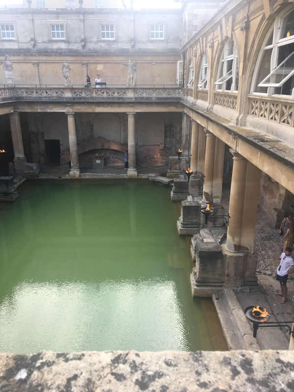
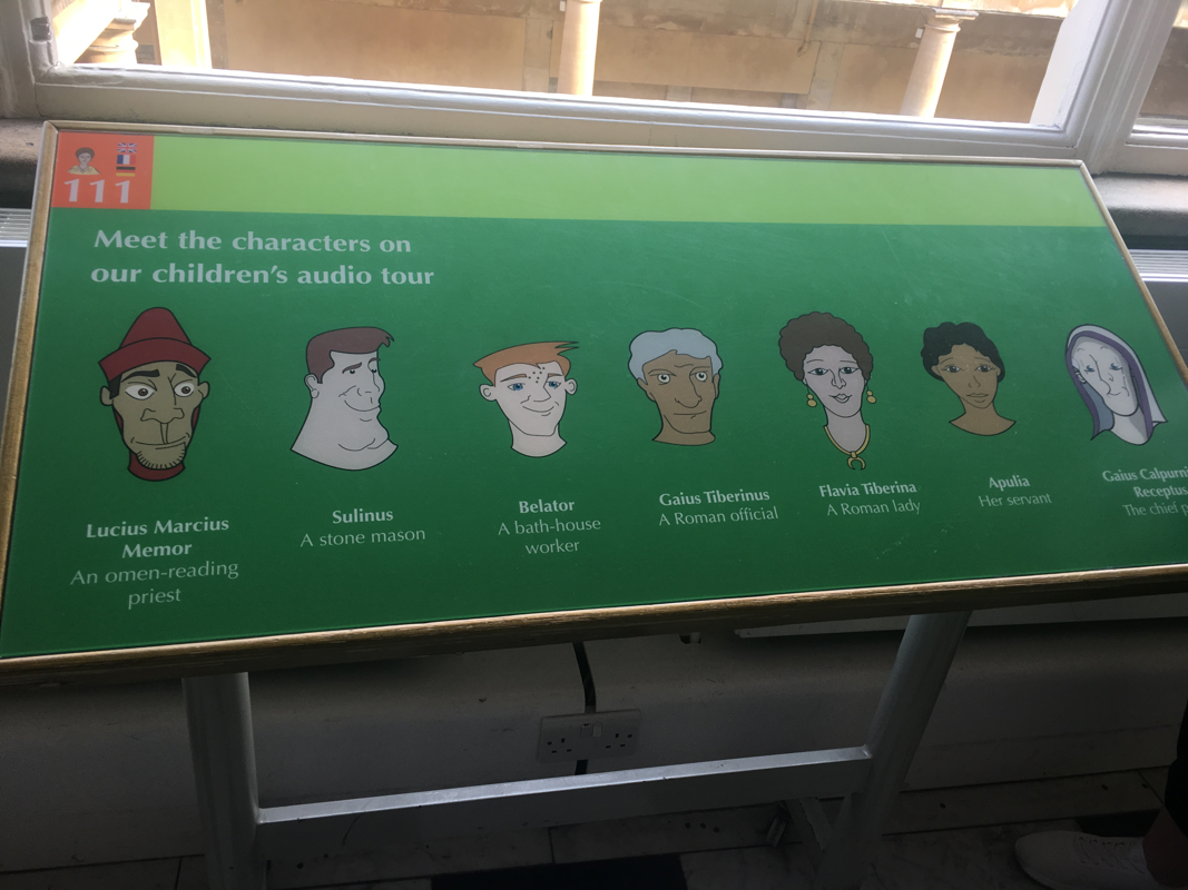
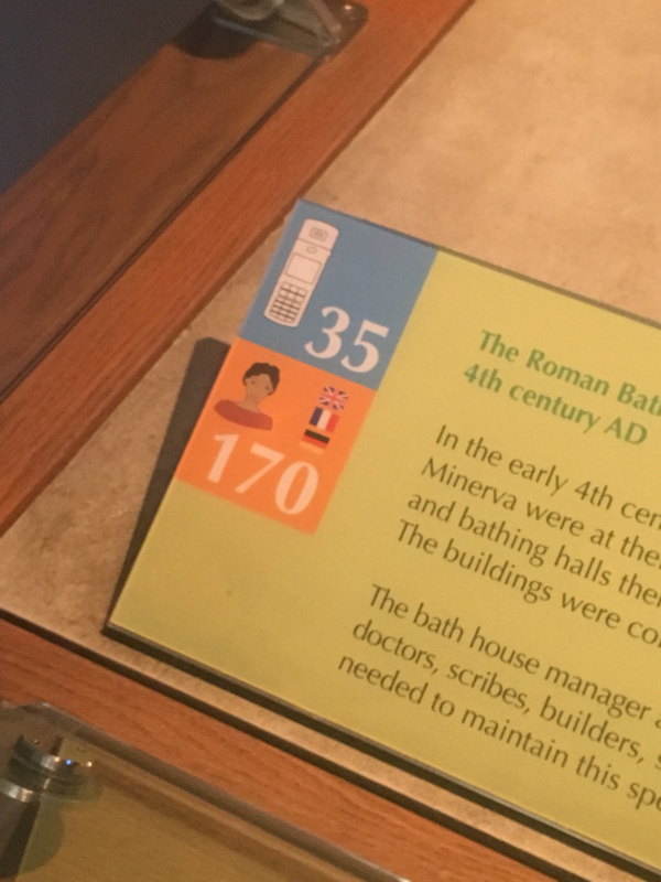
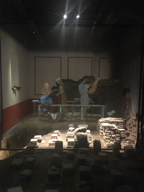
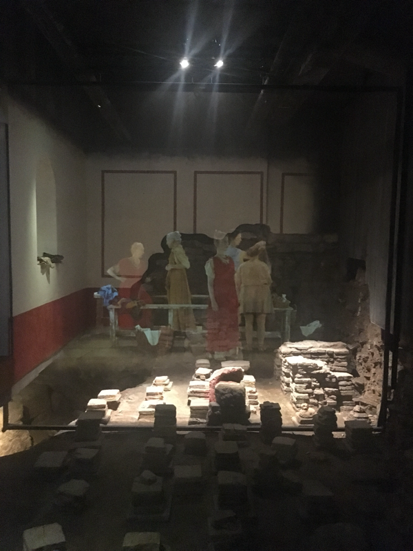
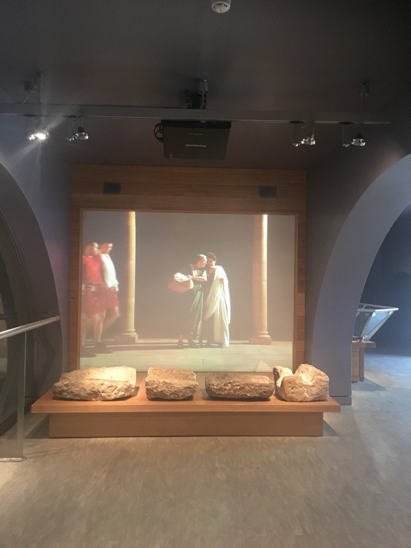
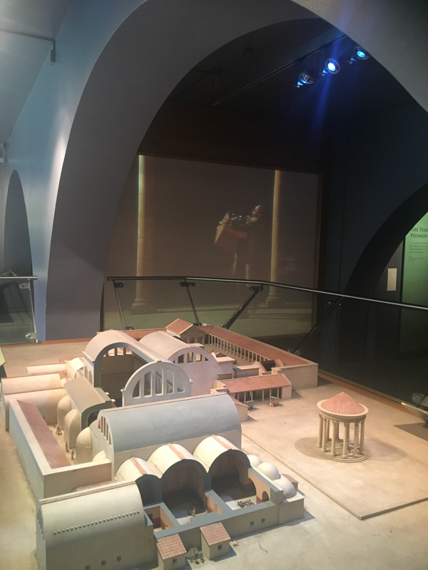
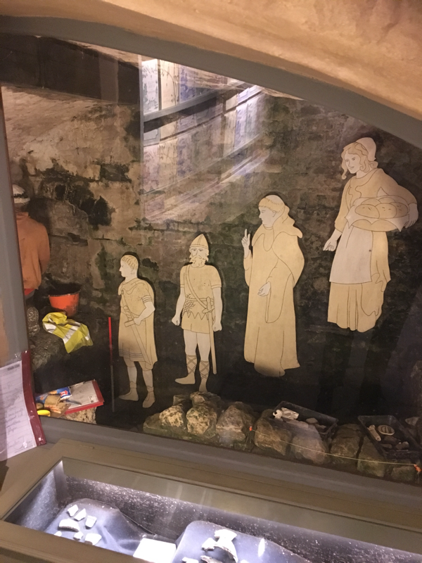
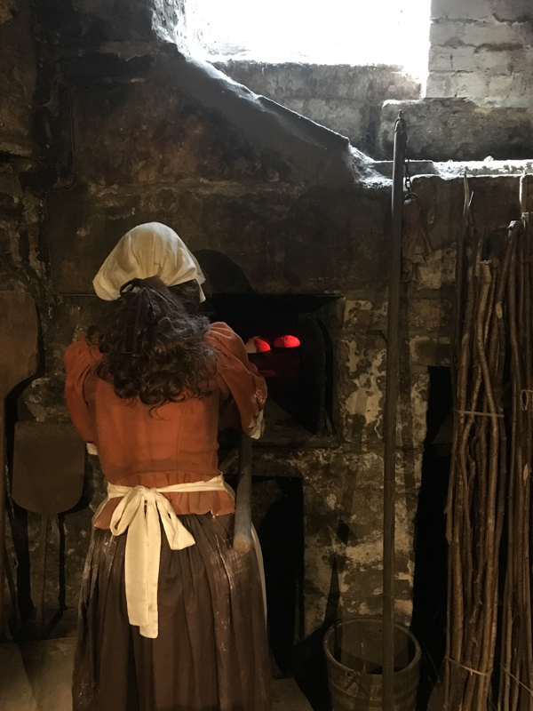
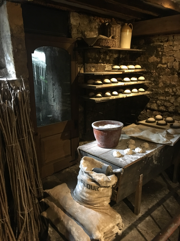
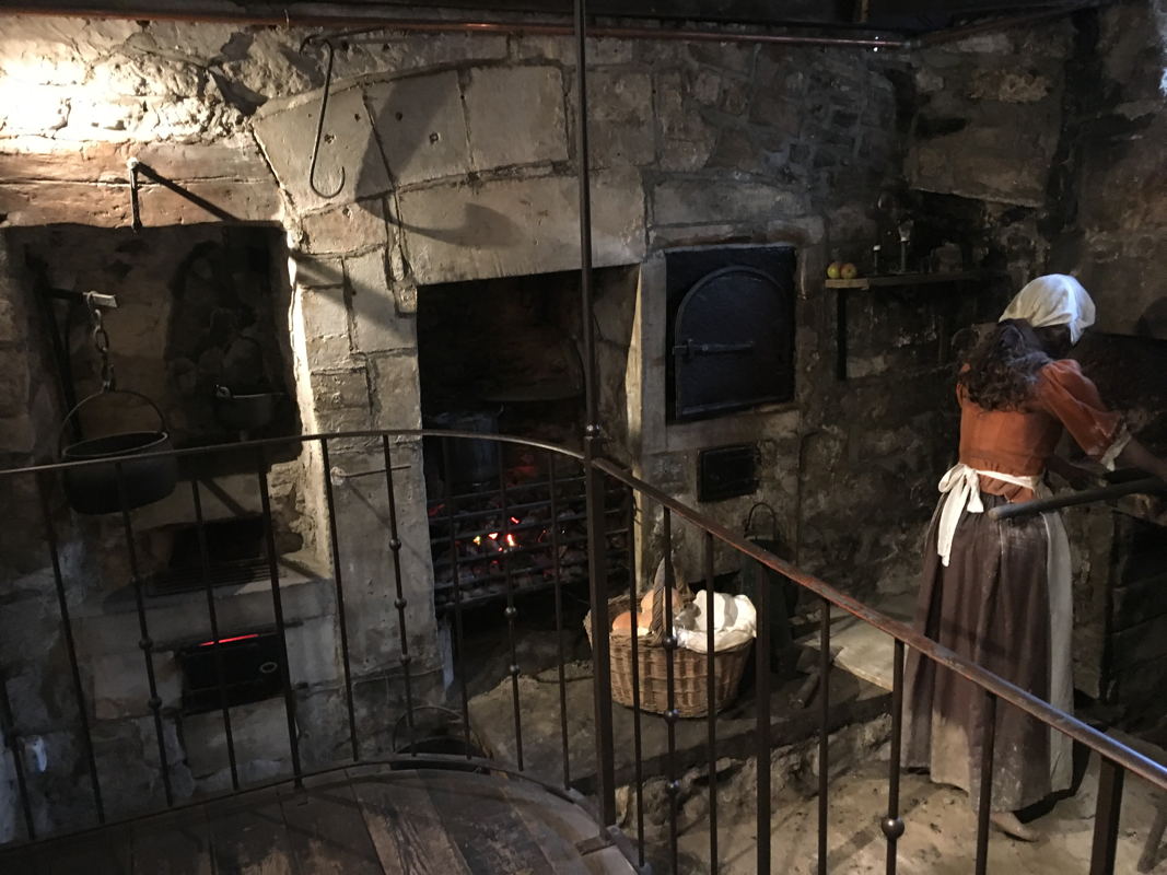
There was so much more then just these points, but these are the parts I have already started using back in my home museum. I must admit, having originally looked at the Open Palaces Programme, I was so excited about the workshops. Finding out that they were group activities, turned my smile into something more akin to ‘The Scream’, with nightmare visions of university group work. But I am so glad that we had so many opportunities to work together. Everyone had slightly different backgrounds and interests, and I have come away from the program somewhat disappointed that chances to work with these incredible people are going to be limited by time and space. They were delightful to work with and learn from! One of the stops that I had been extremely excited to see during the Open Palaces Programme was the Roman Baths. I ended up visiting twice, which I am so glad for, because there is no way I could have taken in the vast amount of information in one session. If you are visiting the Roman Baths as a tourist, I would highly recommend going to the summer evening sessions. It’s a little quieter, and the location takes on a very different atmosphere once the glare of sunlight dims. Also, contrary to the descriptions of the taste of the water, I didn’t find it repulsive. Someone during the tour described it like ‘warm water, served through a sweaty sock’. I would describe it more like warm bore water inside a metal tin. It was odd, but not awful. As a museum enthusiast, be prepared to take a lot of notes. There is a whole lot to see and think about. There are some significant differences between The Roman Baths and the vast number of heritage sites in Australia. Firstly, there seems to be an entire country of people visiting it everyday. The Roman Baths had a whopping 1.2million people visit it during the last financial year This is remarkably close to the Australian War Memorial in Canberra, who stood at 1.12million during the previous financial year. The part that makes this particularly incredible, is that those 1.2million visitors are walking through and touching the ancient space. There are areas that are protected, but when you are walking on those ancient stones you are stepping on the real stones. There are places where you can put your hand on the building and almost feel the weight of the years behind it. I can’t image the work that must be achieved behind the scenes by a dedicated conservation team to make this possible. From all those people visiting and some brilliant retail/hospitality choices, The Roman Baths turns over a very tidy profit each year. It’s important to keep that in mind when looking at the incredible set up that exists there, I can imagine that a good amount of that is achievable because they sell themselves extremely well. I was also incredibly impressed that in their annual report, they reflect on the benefit that has reached the wider community through generated tourism revenue and employment. The two fantastic take homes from the Roman Baths, for me, was the diversity of their audio guides and brilliant use of scrims. We had a workshop session with the Education Manager, Lindsay Braidley, who was entirely inspiring. Much of the workshop revolved around placing people back into the site, and their work on creating audio tours that felt personable. I also fell in love with the concept of the ‘Tripod of sustainability’ which includes Customers, Commercial, and Conservation. I will likely cover that much more in another blog post (most likely when I am day dreaming about working in Bath). Audio guides and I, are not normally friends. I like strolling at my own pace, and being required to stand in front of an object while someone talks in my ear is not my idea of a good time. Generally I find them hugely irritating and kind of pretentious. The key is, that most guides are there to inform the visitor about details, and without a guide there is a good chance of missing information. So it was with a heavy heart that I picked up an audio guide and started winding through the ginormous crowds of people. The Roman Baths has gone out their way to match people with an interest through different programs. From memory the guides included children, adults, archeology, geology and (my personal favourite) the Bill Bryson tour. You are not locked in to hearing only one, you can key into which ever one interests you the most, giving me some power over what style of information that I wanted. The Bill Bryson one particular appealed to me, because it was really a bit like wandering around with a mate who liked to think about things, and was very accessible. The children’s audio guide was quite enjoyable, and included a variety of characters that kids could connect with. I found myself frequently tuning into a session, because they were so personable. The audio points are all over the place, and there are few spots which don’t include them. Audio guides were free with admission and available in a wide range of languages. Scrims! I personally love the use of a good scrim, but not everyone does. A scrim is an incredibly thin piece of fabric, that is mostly see through, which you can either print or project an image onto. The reason that I love them so dearly is that you can very effectively create a scene where the current and the past bump up against each other. This is particularly useful in heritage locations when restoring a location to the vision of the past is not suitable or in interpreting areas which are difficult for a participant to imagine. The Roman Baths were using a large numbers of scrims with incredible results. Many of the rooms that are still being researched and used by archaeologists had scrims with projected scenes of everyday use in the space. The character actors were not often speaking (which is great for avoiding language or hearing barriers), but soundscapes created the atmosphere of noise that would have been heard within a busy location full of people. In some locations, scrims were used in conjunction with items that were placed around the area, further creating the illusion of the scene. It was an incredible experience and I found it very sympathetic to the spaces, and really felt like seeing the ruins and combining the scenes made the building extremely relatable. The Roman Baths are well worth a visit for some wonderful cutting edge museum practice. They will soon be opening up a new area, which is highly exciting. I really recommend checking out their annual reports if you are in the museum business, because they are fascinating. They also have a wonderful website full of educational programs that can be downloaded and studied in detail. It was truly a wonderful experience. Sally Lunn’s was the first museum I checked out during my Open Palaces Programme adventure. The day before the tour started, I decided to stomp my way around Bath locating some of the places that I would be coming to and getting an idea of the location. Plus, I was in Bath! My excitement levels were so high I felt like my little heart was going to bounce straight out of my chest. Sally Lunn’s is located close to the heart of the town, and within an easy walk from the train station and Roman Baths. The top part is a great little restaurant dedicated to serving a historic themed menu, including something call a Bath Bun, which is a little like a very large dinner roll which has been sliced in half. The Smithsonian mag describes it much better then I as “nearly six-inches in diameter with a soft, domed top, it is like a brioche bun on steroids”. I didn’t get a chance to eat there, but I can say that the smells coming from the kitchen were enticing. I will note, the food was surprisingly affordable and it’s a regret that I didn’t find the time to eat there. Below the restaurant is a small museum dedicated to the history of Sally Lunn’s. I personally wonder whether there is a better word to call it then a museum, but heritage site doesn’t really do justice to the level of contents. I wouldn’t call it a heritage house either. It is not a traditional museum of ‘things in cabinets and words on walls”, but a fully recreated set of scenes that interpret the space. On one side of the small space is a fully recreated kitchen, with some fantastic looking fake food. Only after you have spent 2 months staring at plastic tomatoes can you fully appreciate realistic fake food. The other side was my favourite, with an explanation of the floor level changes and a plaster archeologist busily excavating a section. What I really loved was the immersion of history combined with the present. The historic section was great, but having a section explaining how the history was being discovered and the different eras of the building was great. On the wall in the modern section was a series of very symbolic figures showing the different depths that the ground would have been at. It was such a simple and effective method of showing those differences, and for someone who comes from a country where cities have not necessarily been built on top of other cities, it was a really useful way to picture it. I loved that the archeologists finds and record keeping were on display (and that he had a neat little packed lunch). The museum was free and really is worth a visit if you happen to be in the area. As a side note, plastic models of people give me the serious willies. I loved that I couldn’t see the faces of either of the figures. But not in a terrifying Blair Witch style. This didn’t seem relevant to the actual review though... Website for Sally Lunn’s: https://www.sallylunns.co.uk Dana Bate: The Squishy History of Bath’s Buns https://www.smithsonianmag.com/arts-culture/the-squishy-history-of-baths-buns-87692089/ |
Museum working, game playing and dog loving geek. Tune in for musings about the GLAM sector, and generally geekiness.
Archives
April 2020
Categories
All
|


 RSS Feed
